The Disco Experience
Designing post-purchase ads that don’t get ignored.
We reimagined Disco’s post-purchase experience to help shoppers find brands they wanted. Through testing, engagement grew from 0.3% to over 4%, driving more repeat purchases and sign-ups.
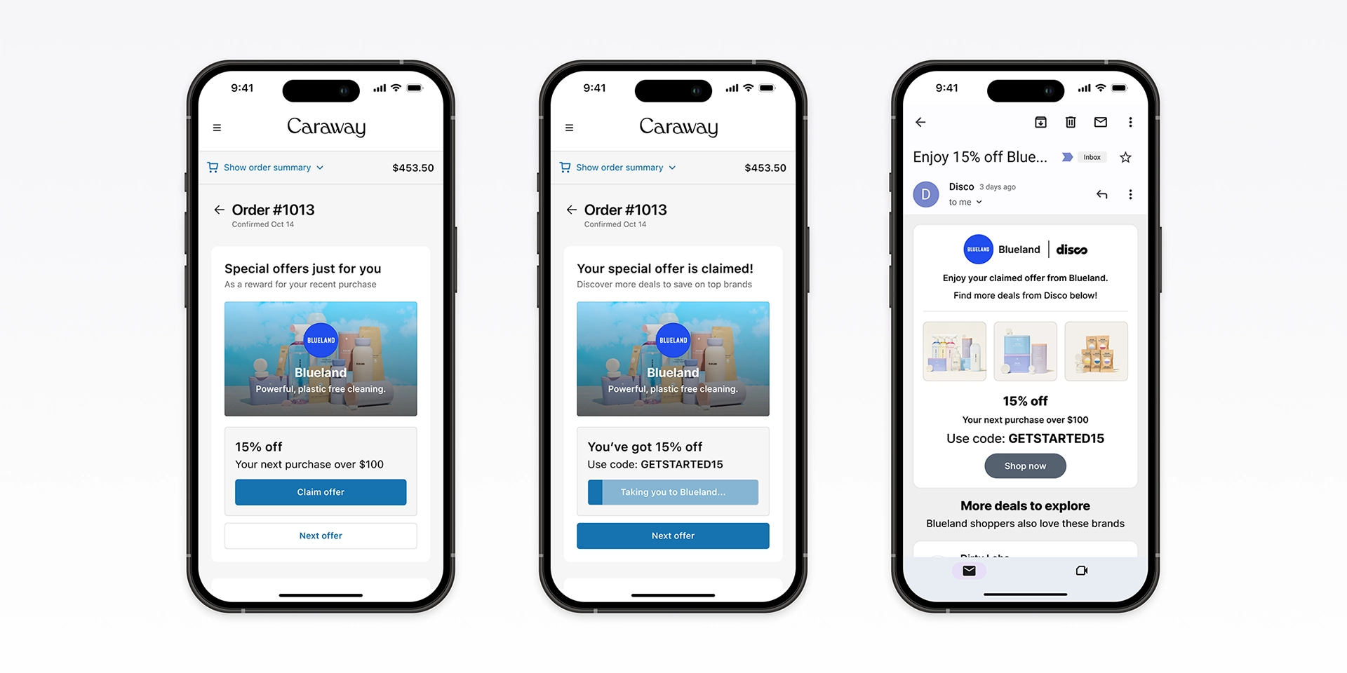
The 0.3% problem
Engagement on the original experience sat at 0.3%. Most shoppers ignored offers.
We set out to make post-purchase moments feel relevant and useful, targeting the 1-2% click-through rates seen on major platforms.
The wrong moment
We ran studies on two questions: why shoppers ignored offers, and what would make offers feel credible and worth claiming. Through prototypes, we tested three approaches: keeping the inline layout, reframing offers as rewards, and simplifying to a single focused offer.
Shoppers weren’t ready to browse right after checkout. Their focus stayed on order confirmation. Familiar brands, clear value, and simple layouts built trust and made offers feel genuine, not distracting.
Inline layout (baseline)
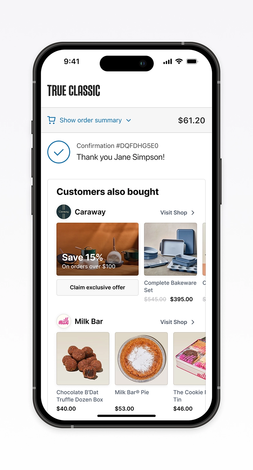
Rewards framing
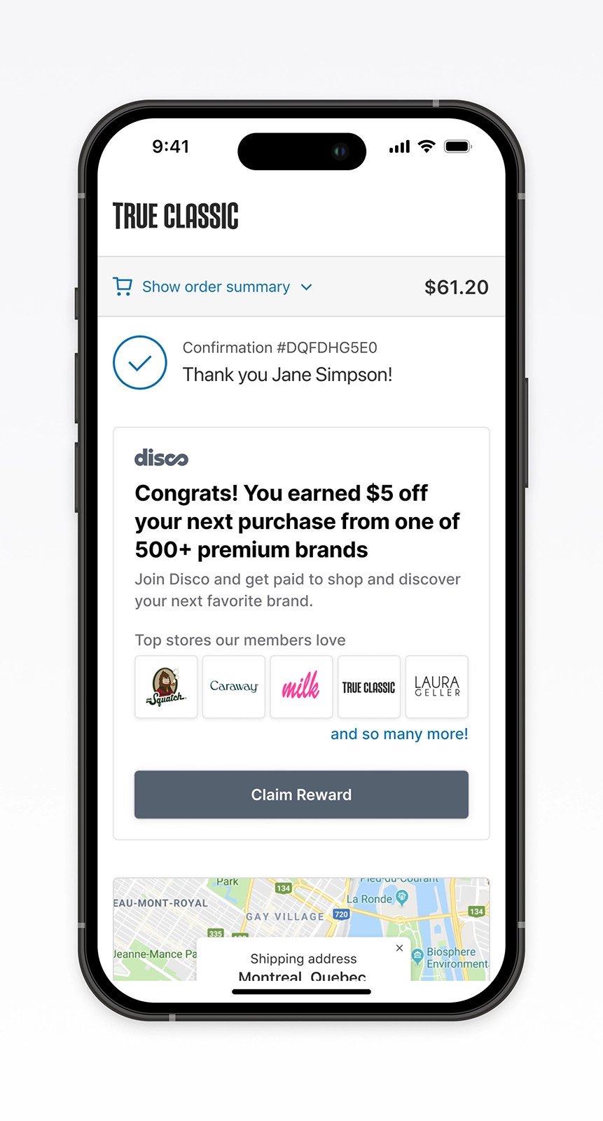
Single offer focus
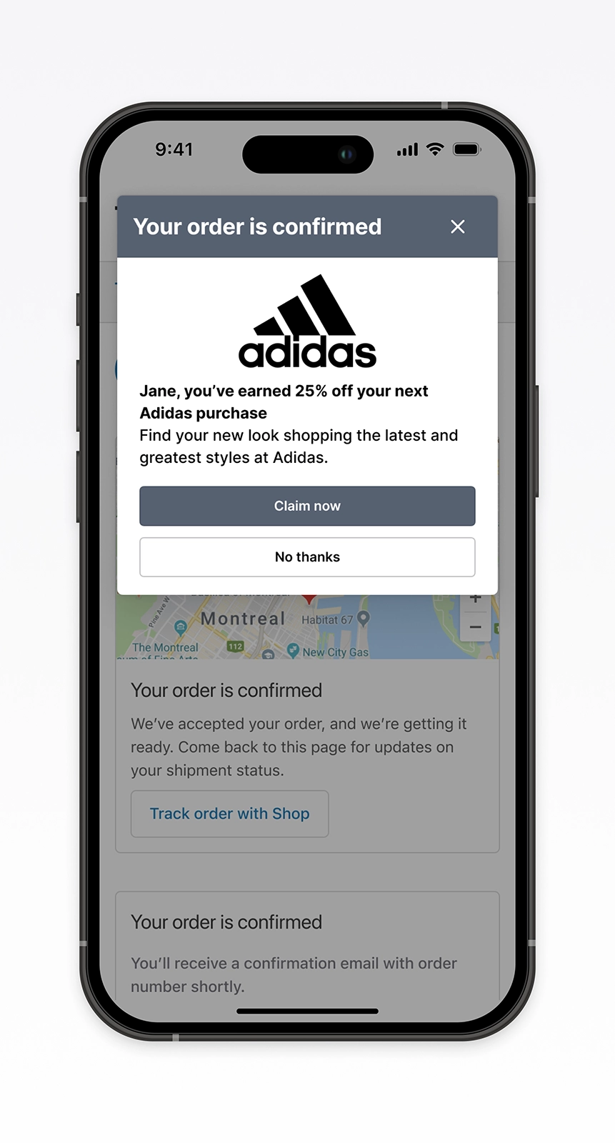
“Most important thing for me is seeing what I actually bought. I want to see where it’s going, my contact info, how much was charged.”
— Q3 study participant
Clarity won
We ran a second study to understand what made offers feel worth claiming. We tested pricing cues, reviews, brand familiarity, and layout variations to see what drove confidence and action.
Clear tone stood out most. Shoppers responded to straightforward language and visual clarity. Reviews built trust. Streamlined layouts reduced effort and made follow-up easier.
Simple offer layout
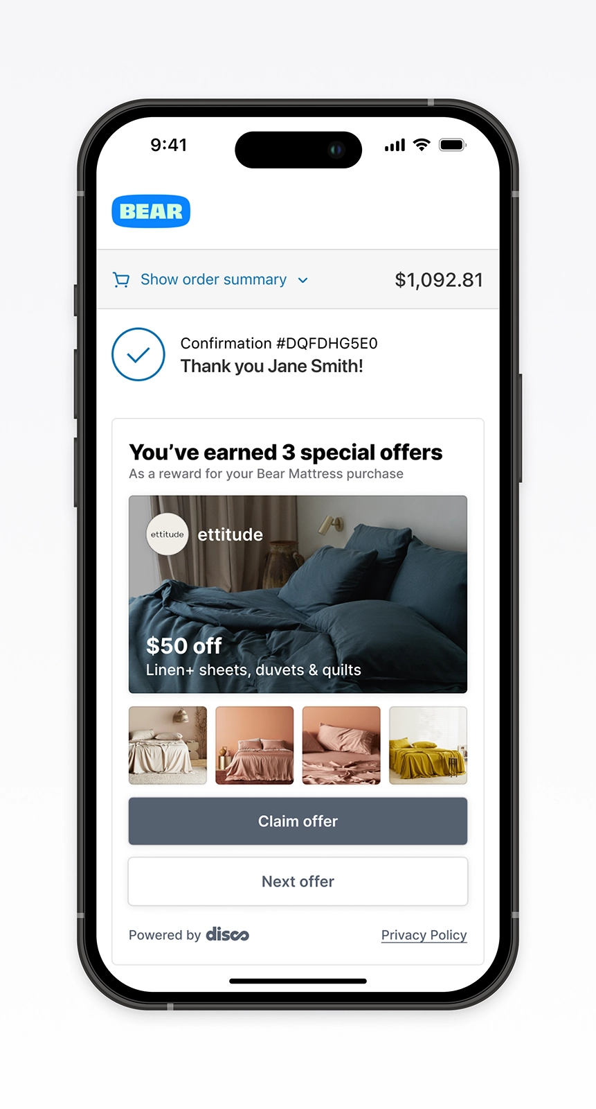
Brand snapshot
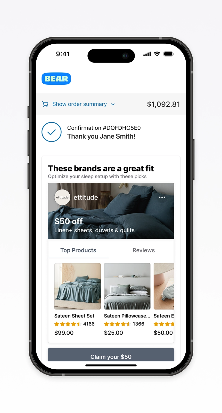
Browse and discover
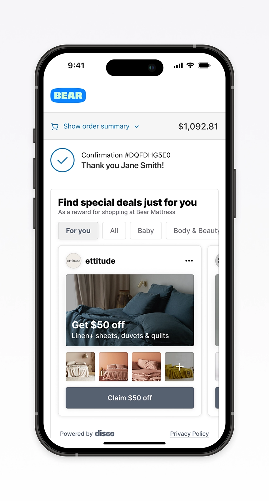
“The messaging feels condescending because I know these offers aren’t exclusive to me; they’re offered to anyone who purchases from this store.”
— Q4 study participant
One offer at a time
We built an MVP to test if a cleaner layout and clearer purpose could improve engagement. The original experience felt crowded and passive. Brands wanted more sign-ups.
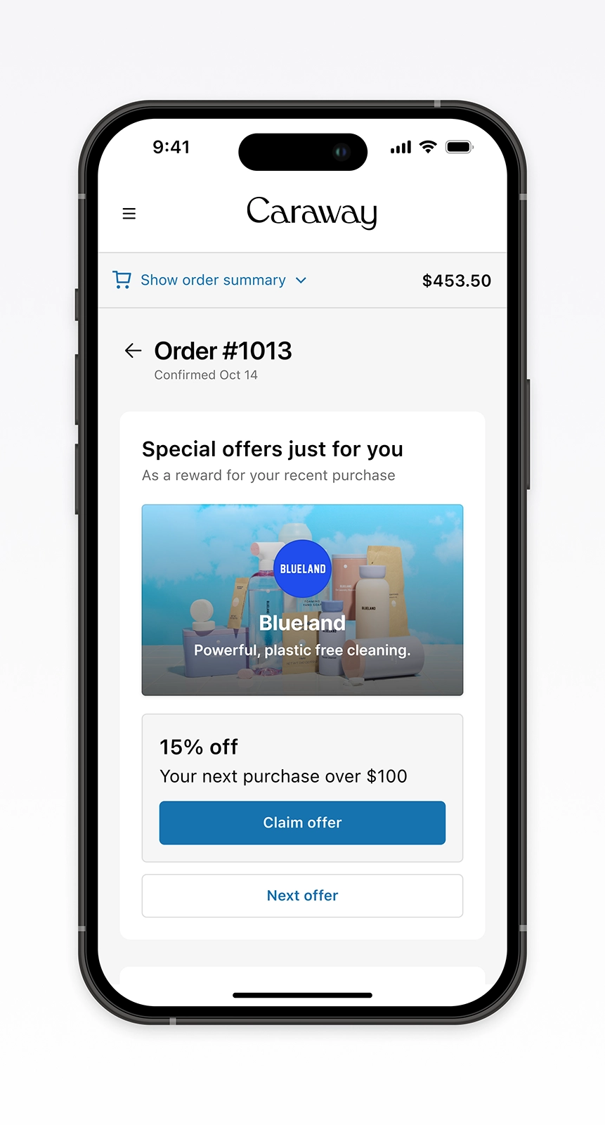
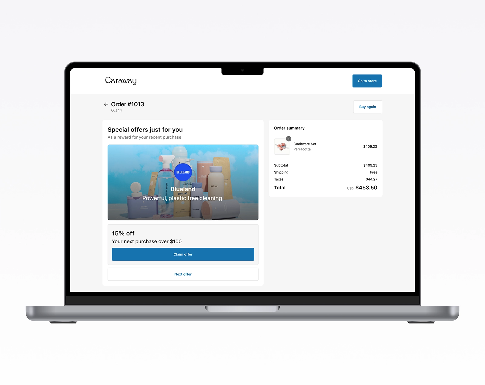
The redesign focused on one offer at a time, anchored in the shopper’s recent purchase. It drove fewer impressions but delivered higher engagement and more value per visit.
Too much at once
The MVP hit a 2.4% claim rate and 1.17% conversion. The next version aimed to fix its weak points.
But too many updates at once blurred what worked. The lesson: smaller experiments, one variable at a time.
One variable at a time
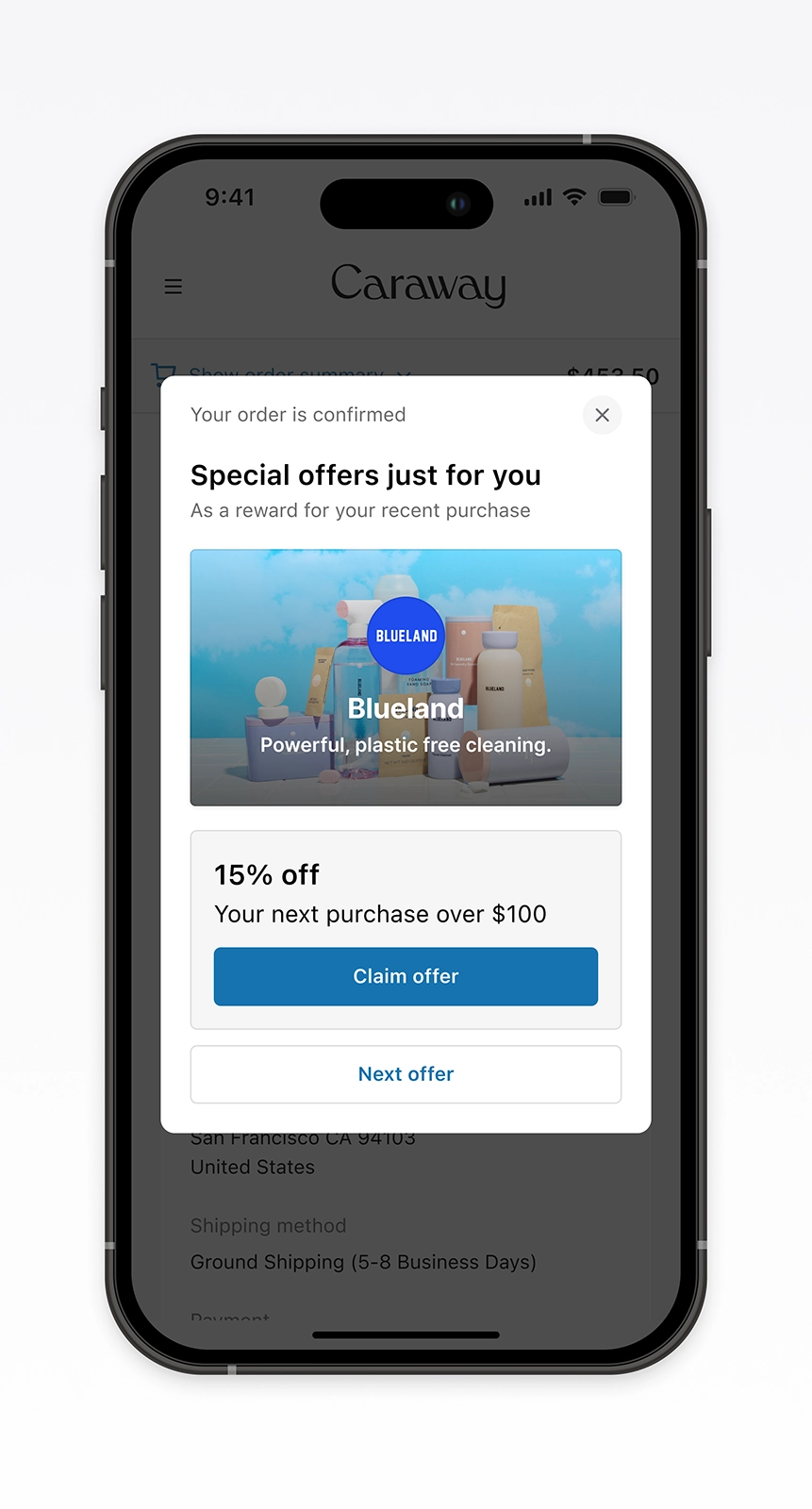
We shifted to smaller, controlled experiments to pinpoint which changes improved performance. Each iteration tested a single variable while keeping the MVP’s best features. Clearer descriptions and larger calls to action increased clicks. Removing product tiles lifted claim rate from 2.5% to 3.8%.
Clarity and simplicity drove the gains.
Product row added
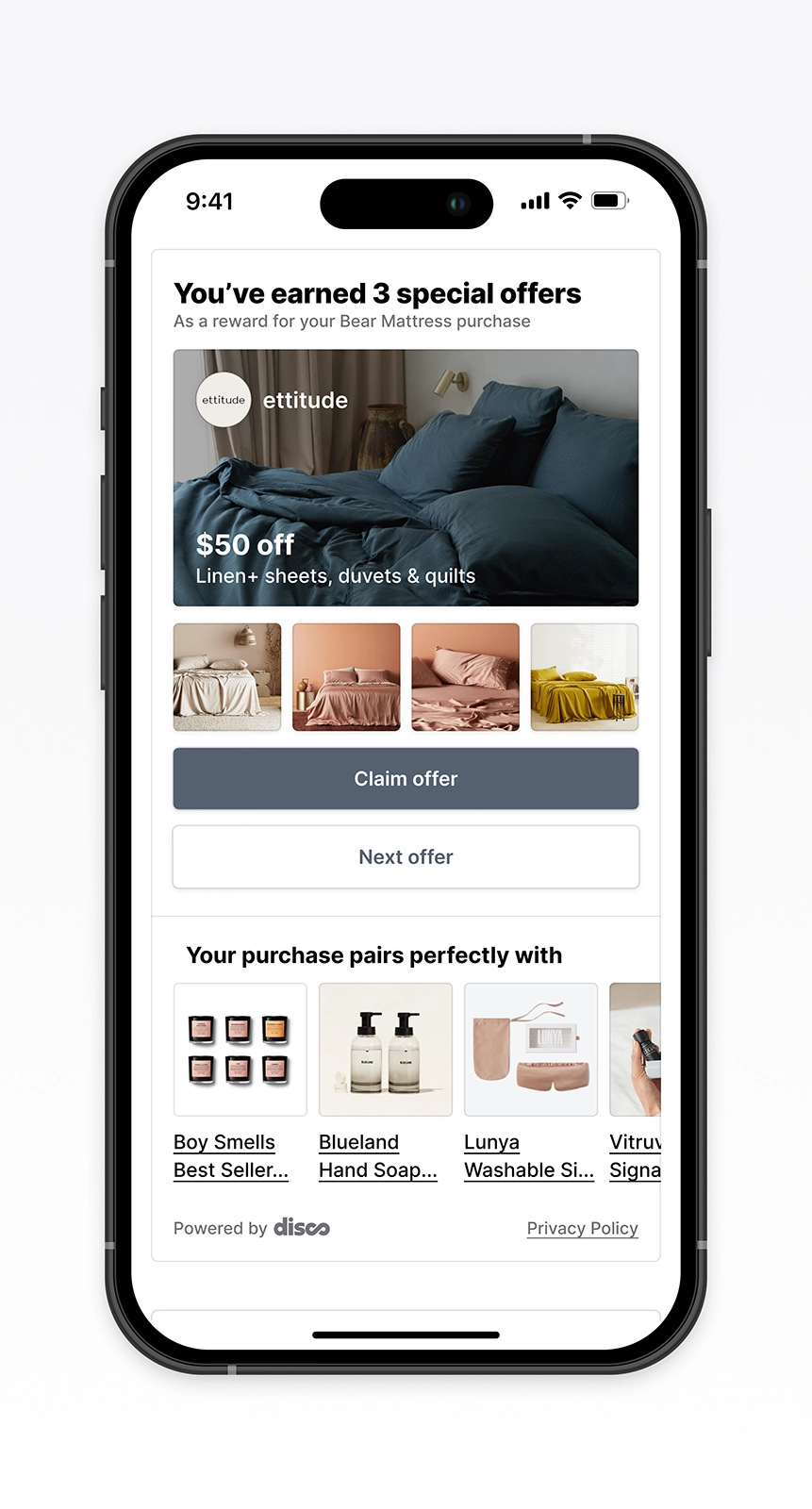
Brand descriptions
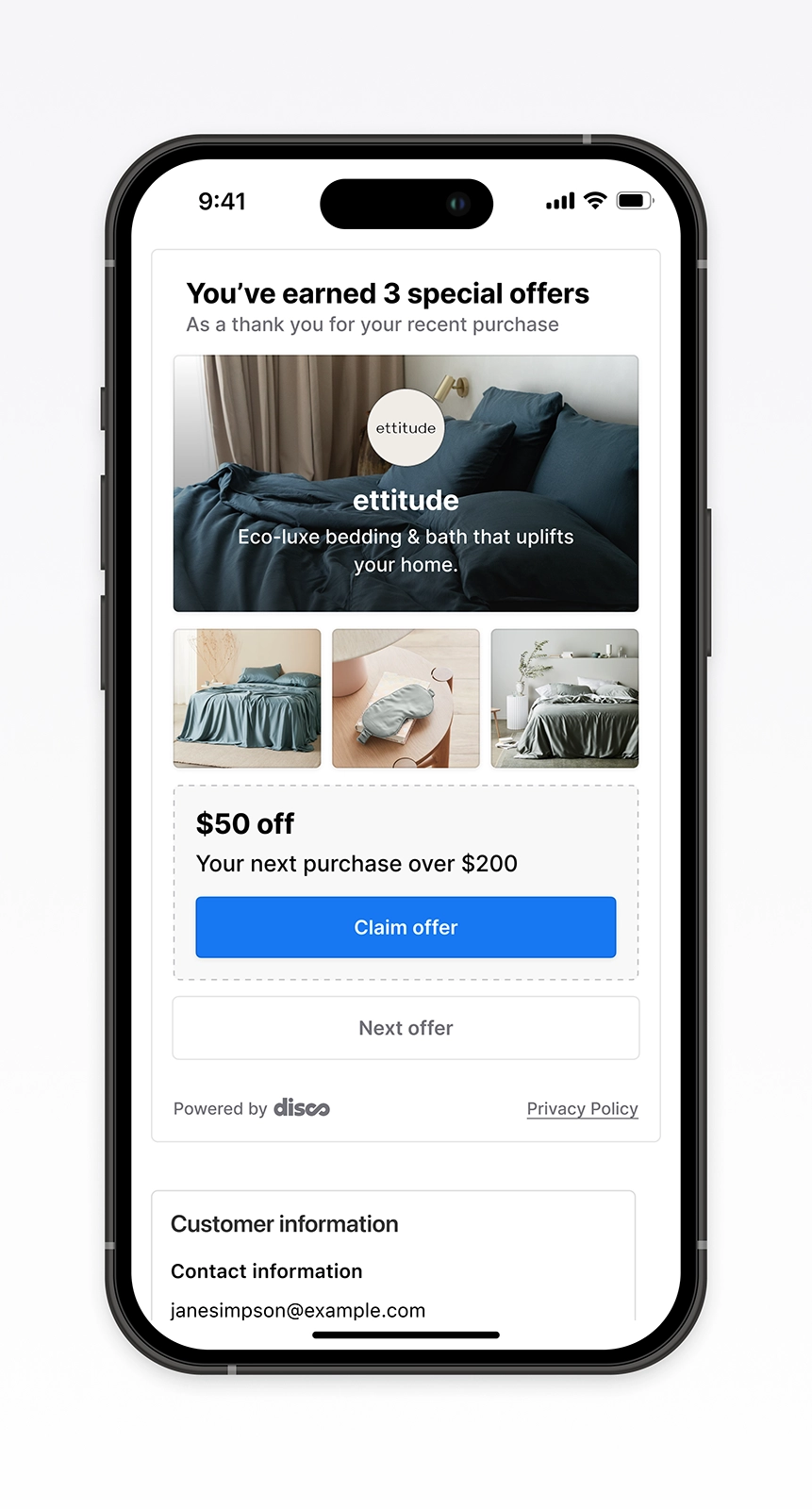
No product tiles
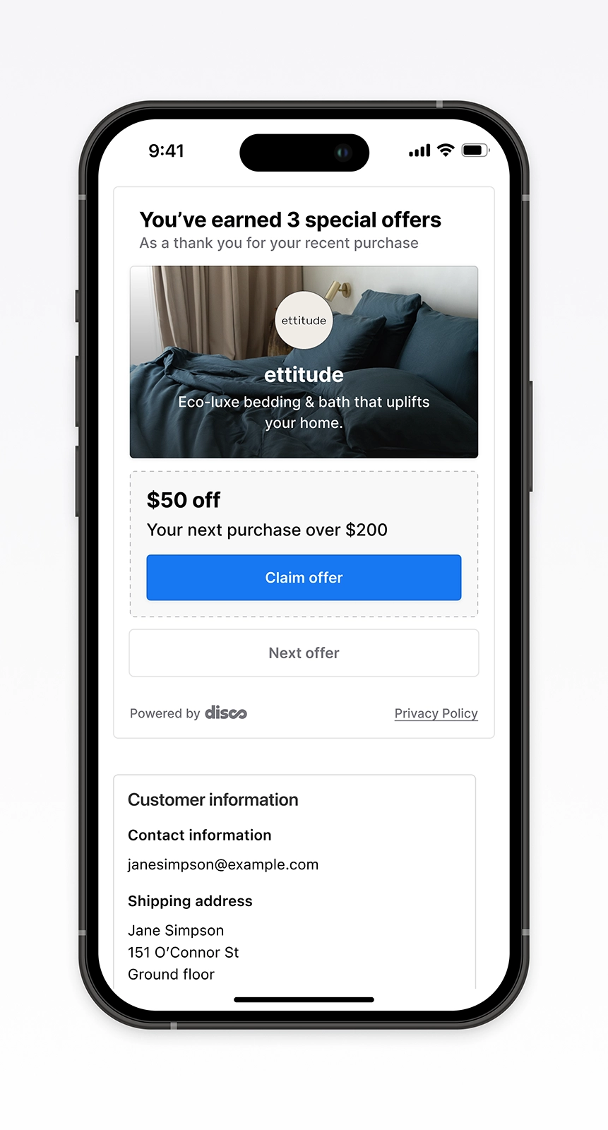
No hero image
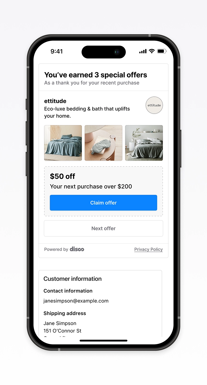
What we didn’t ship
Testing revealed that shoppers valued credibility and transparency in post-purchase moments. We explored ways to build trust, from showing claim counts for social proof to adding ratings and short video for storytelling.
Each concept showed promise but cost more to build. We paused development for leaner tests. They delivered faster insight and laid the groundwork for the core design system.
Social proof
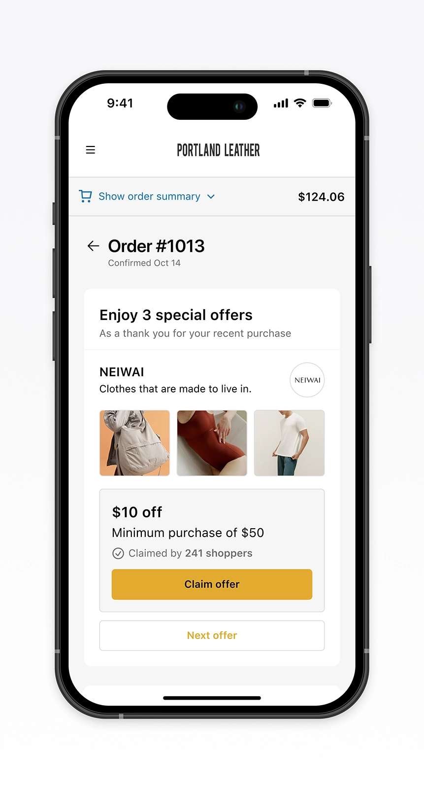
Credibility
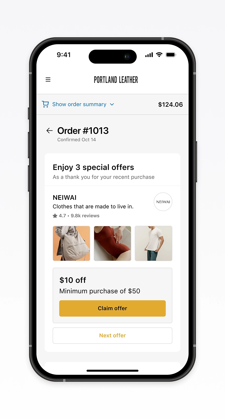
Storytelling
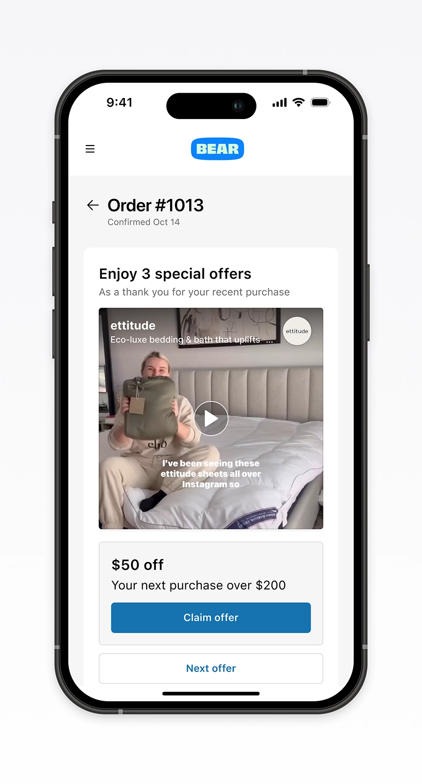
Offer visibility
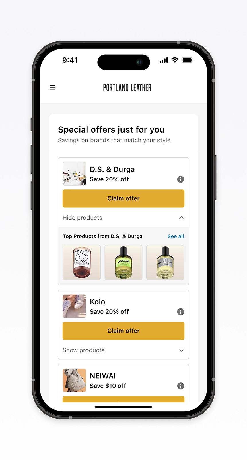
What worked
This version became the foundation for scaling across brands and platforms. We built a mobile-first flow that reduced friction. Clear hierarchy, tone, and imagery guided action.
By presenting one offer at a time and leading with visuals, the design stayed consistent from claim to follow-up. It hit the highest engagement of any test and laid the groundwork for a system that could scale across formats.
Built to adapt
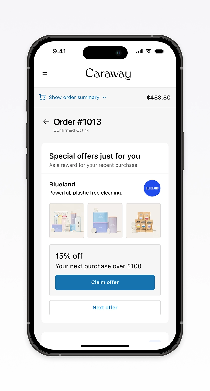
As the business grew beyond direct-to-consumer brands, scale depended on adaptability, not repetition. Each platform required its own balance of clarity, flexibility, and performance.
Some leaned on brand imagery or full-page immersion, while others simplified for technical constraints. This structured flexibility preserved trust and clarity across partners. The experience scaled with the business.
With brand row
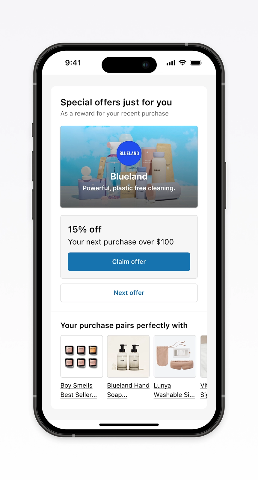
Full-page takeover
No hero imagery
Other publishers
0.3% to 4%
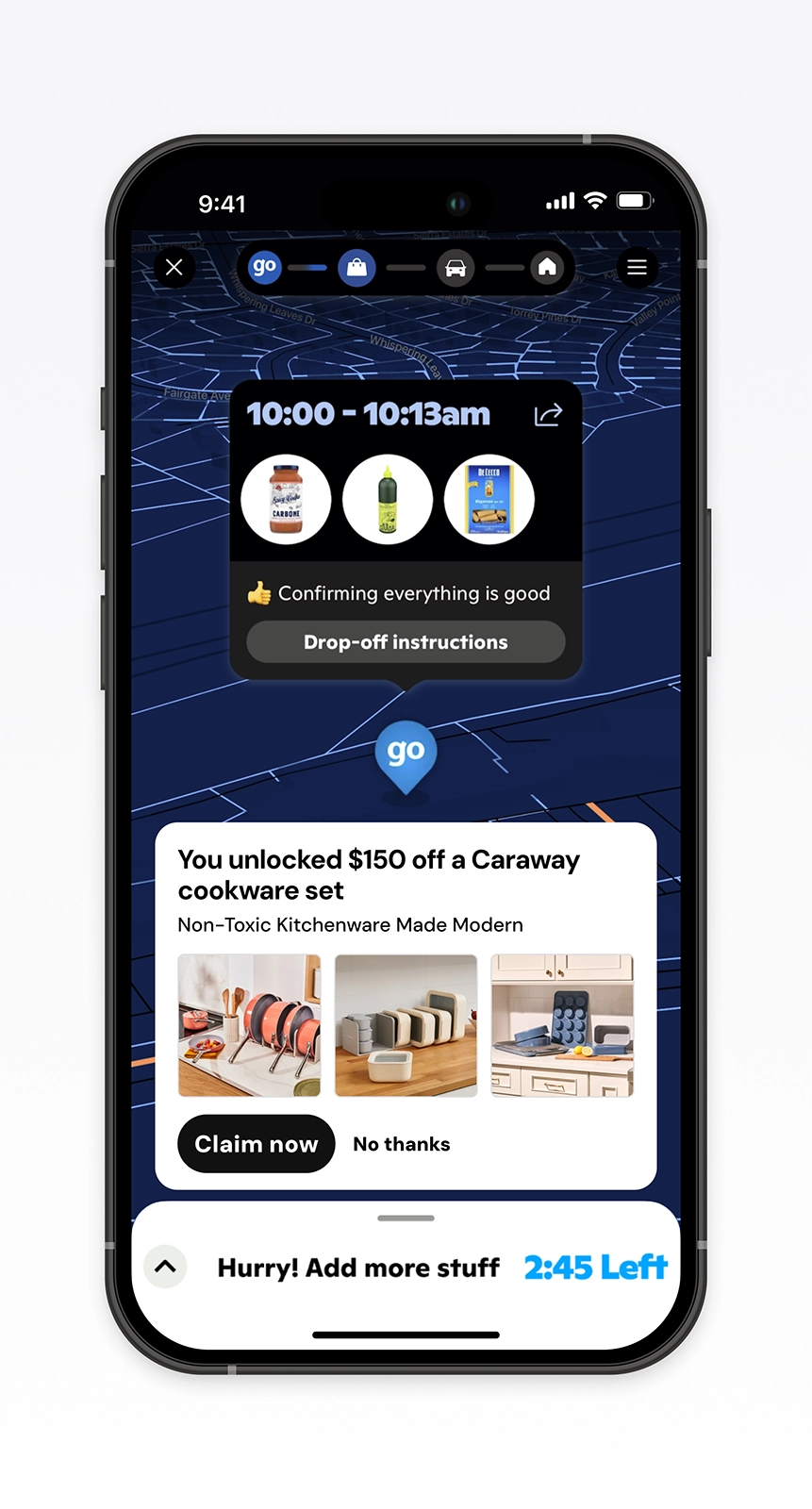
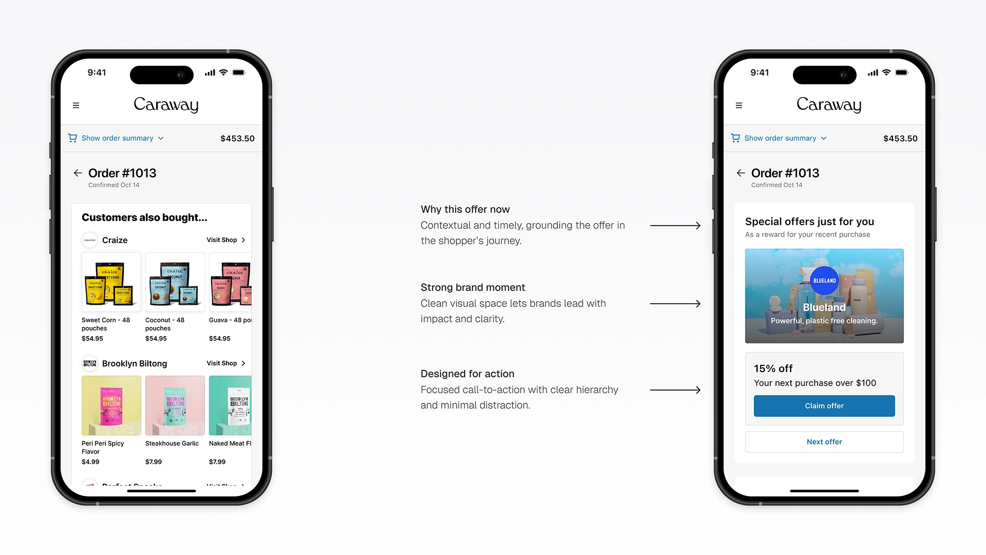
The original experience crowded shoppers with too many products and little context. The redesign brought focus, guiding attention to what mattered most.
Engagement grew from 0.3% to over 4%. Revenue increased more than fivefold. Shoppers found brands they wanted.
From clutter to clarity
What grew from it
The redesign became a shared foundation for clarity and scale across design, product, and engineering.
Brand supply and technical scale sat beyond design’s reach. The work still laid the structure for expansion.
Disco reached larger publishers and new markets.
Credits
- Product Manager: Dan Kaufman
- Product Manager: Graeme Kemp
- Frontend Engineer: Aryan Gupta
- Backend Engineer: Cassidy Haas
- Data Science: Peter Li
- Product Marketing: Miriam Young
- Product Designer/Manager: Justin Carrasco